The Project
To implement a landing page that furthers Scuf Gaming's e-commerce goals.
To implement a landing page that furthers Scuf Gaming's e-commerce goals.



The Problem
In the current site there are many different channels to shop from, but no overarching page for easy browsing that incorporates all the goods Scuf offers.
In the current site there are many different channels to shop from, but no overarching page for easy browsing that incorporates all the goods Scuf offers.
Establishing Hierarchy
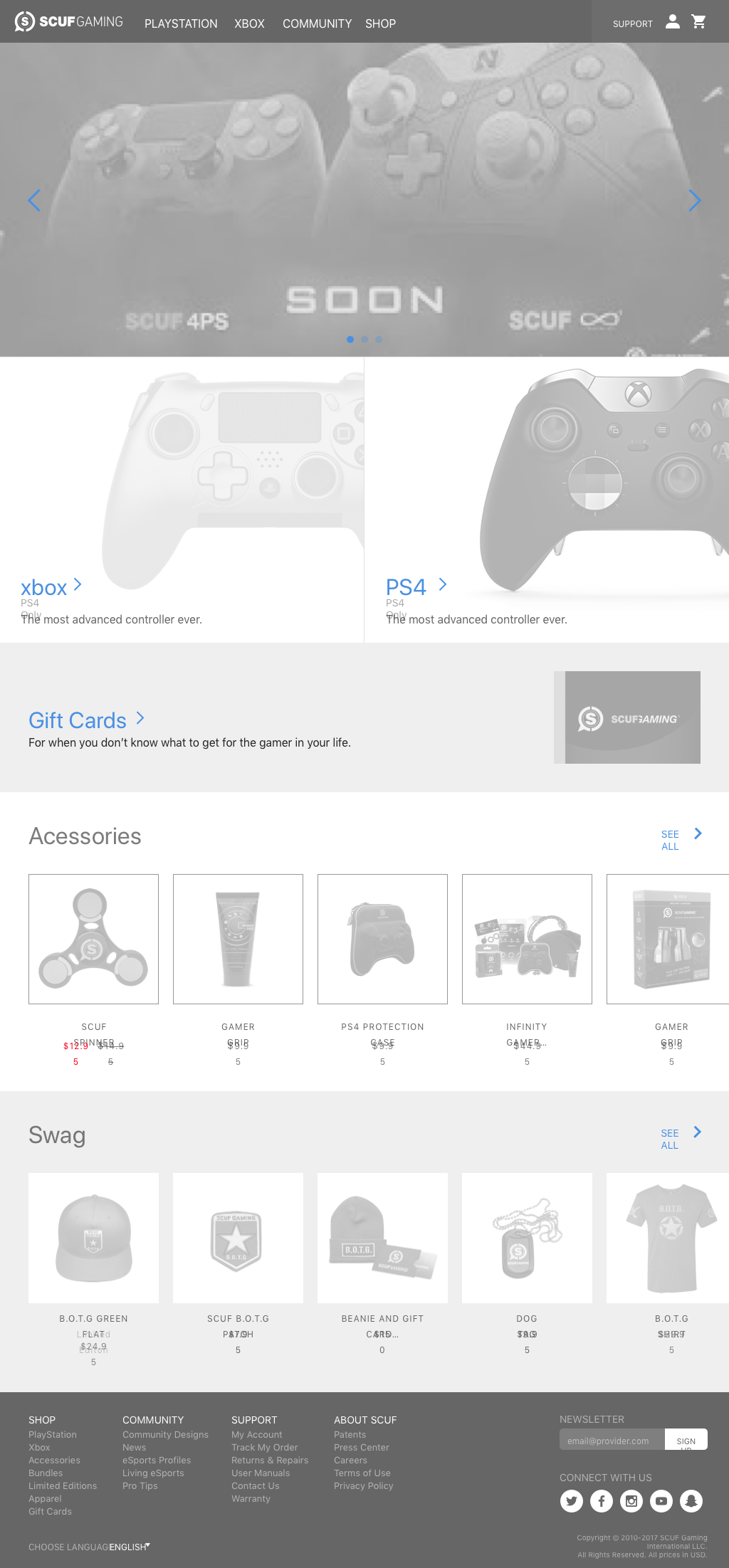
Their inventory is broken into PS4, X-box, accessories, and swag. On top of that we want to incorporate promotional material, gift cards, and highlight the customize feature.
Their inventory is broken into PS4, X-box, accessories, and swag. On top of that we want to incorporate promotional material, gift cards, and highlight the customize feature.
Sketches
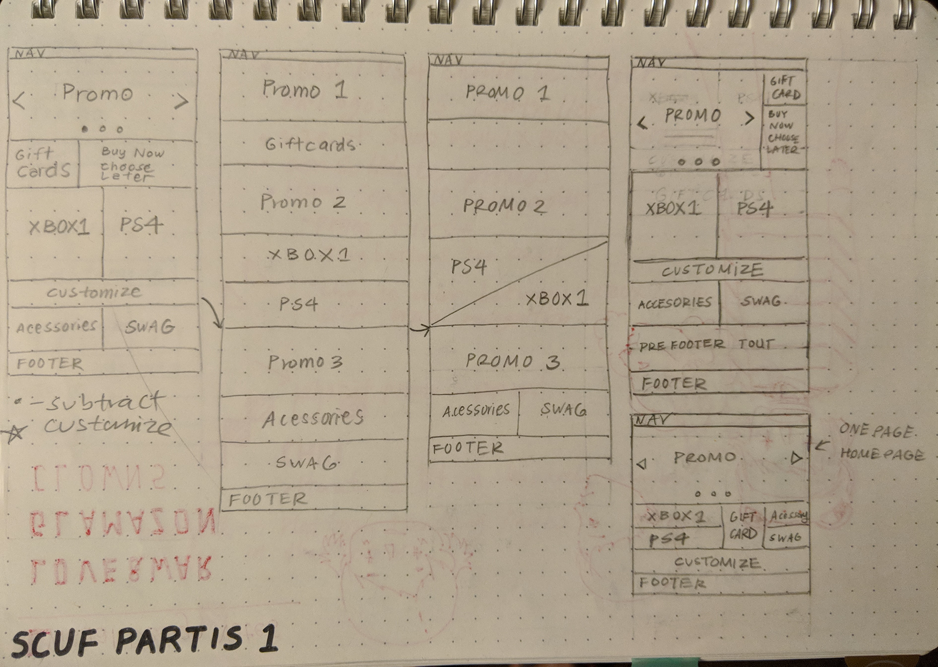
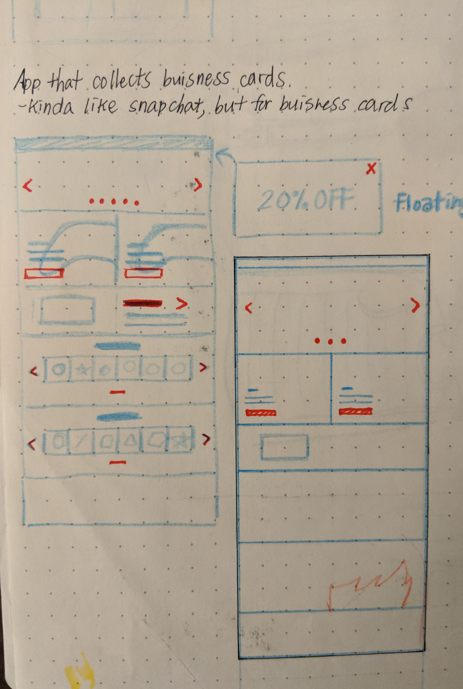
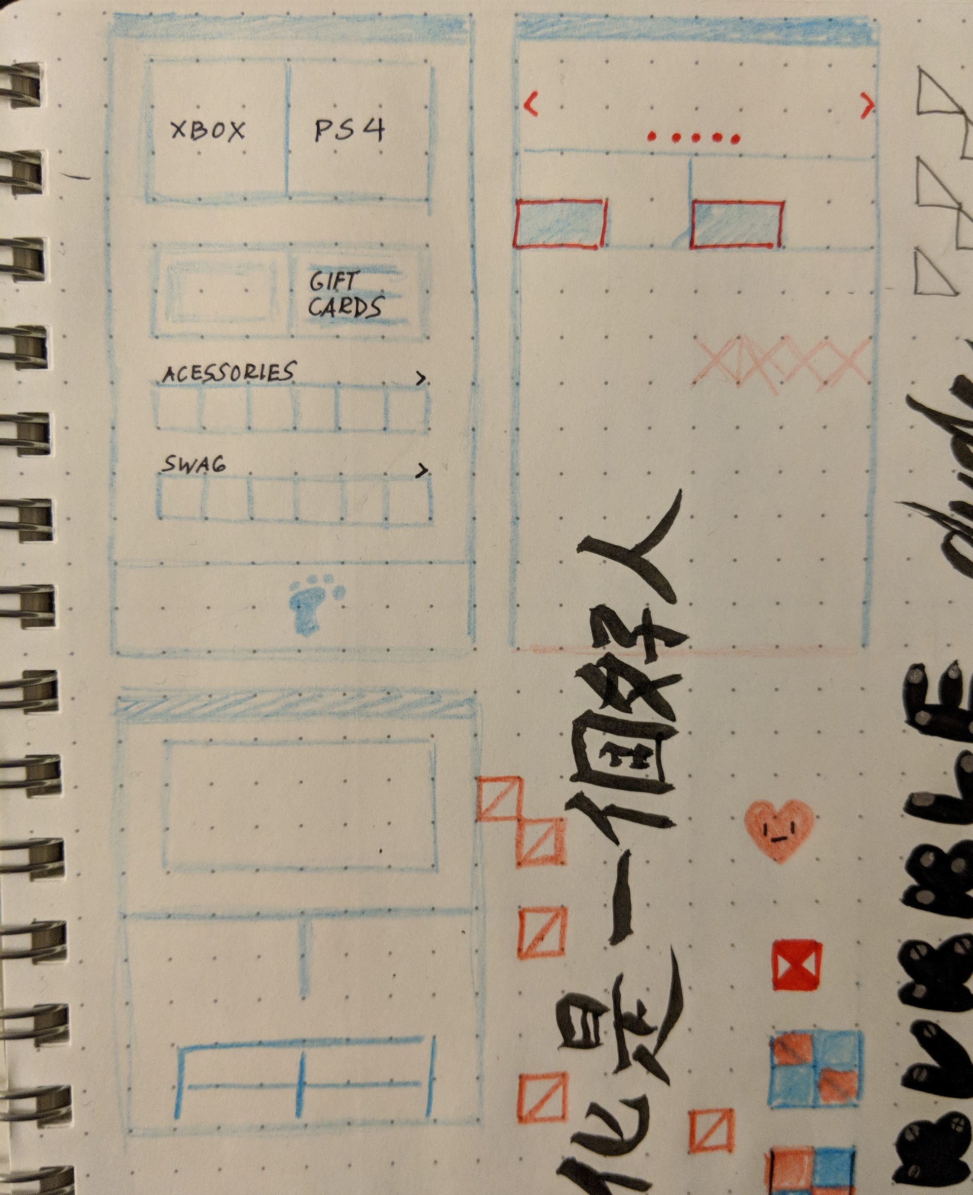
From there I sketched different possible solutions that makes the most sense to a consumer.
From there I sketched different possible solutions that makes the most sense to a consumer.

Lo-fi Wireframes
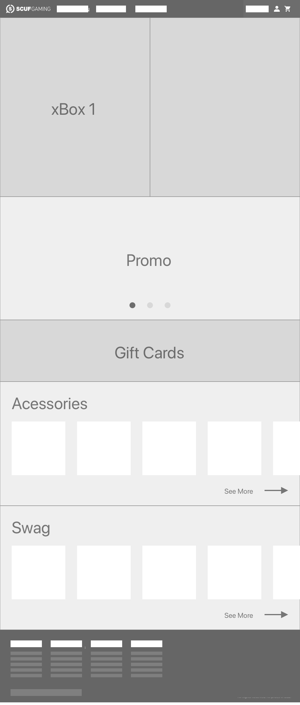
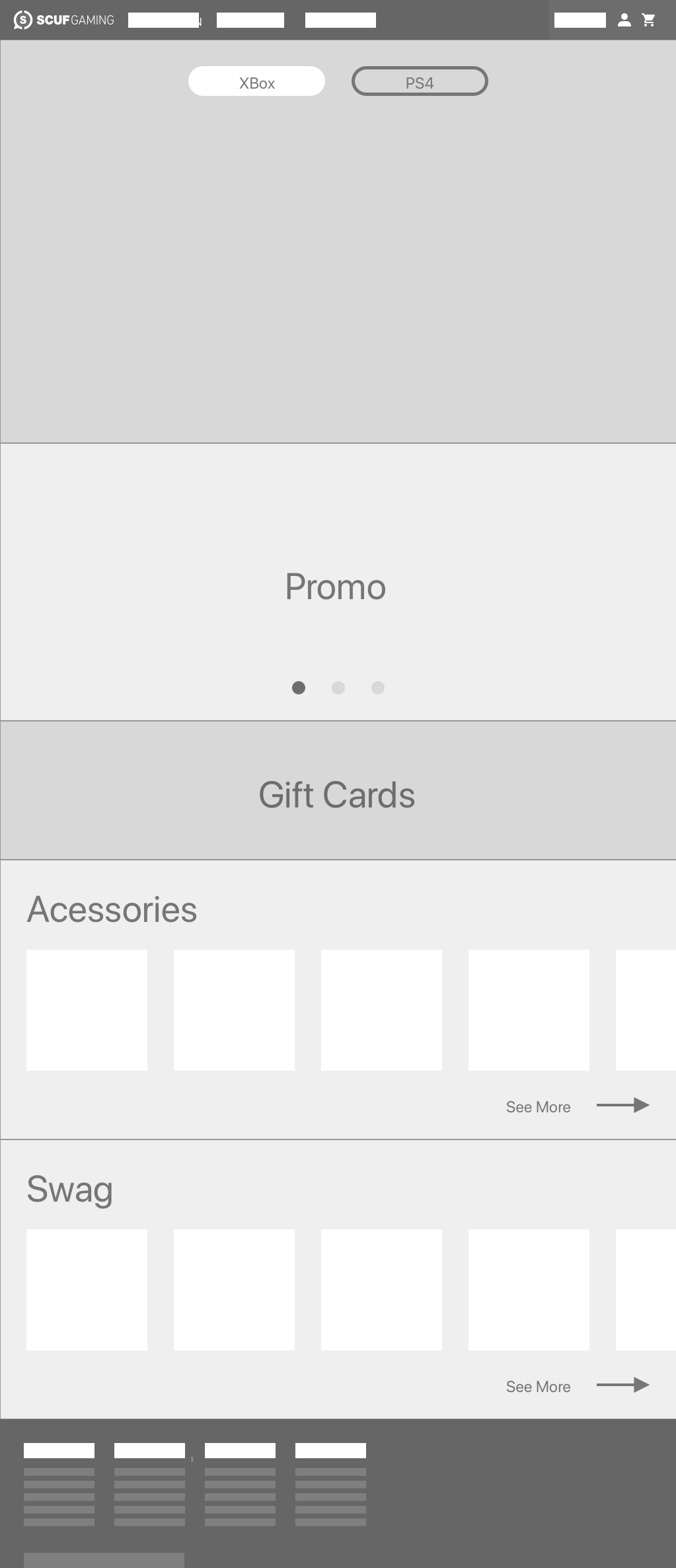
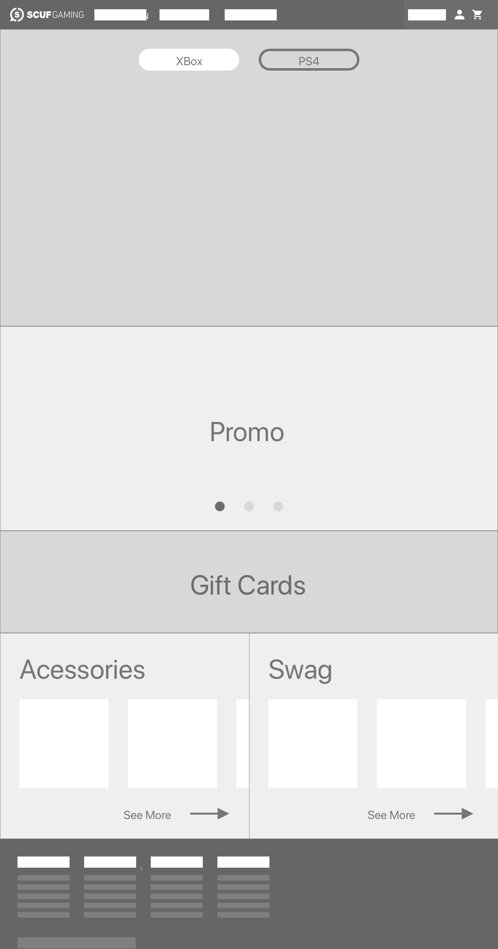
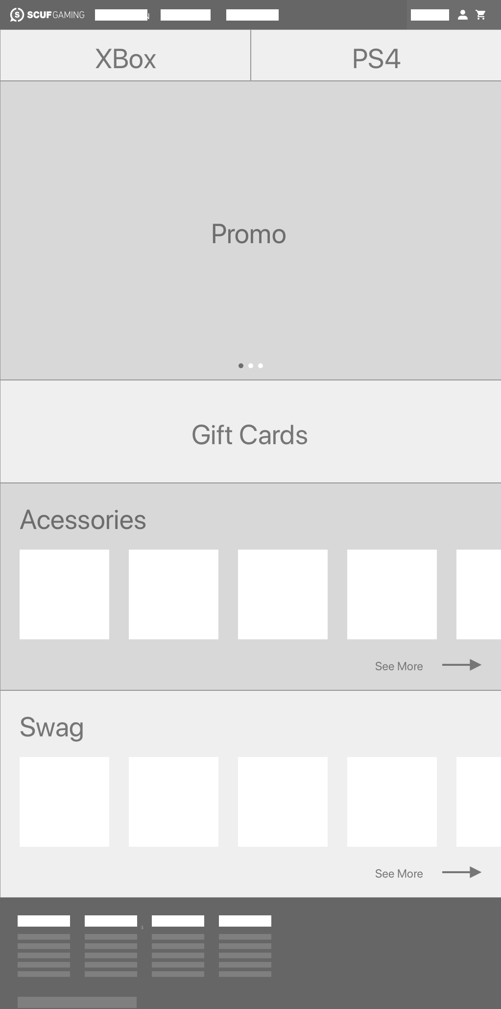
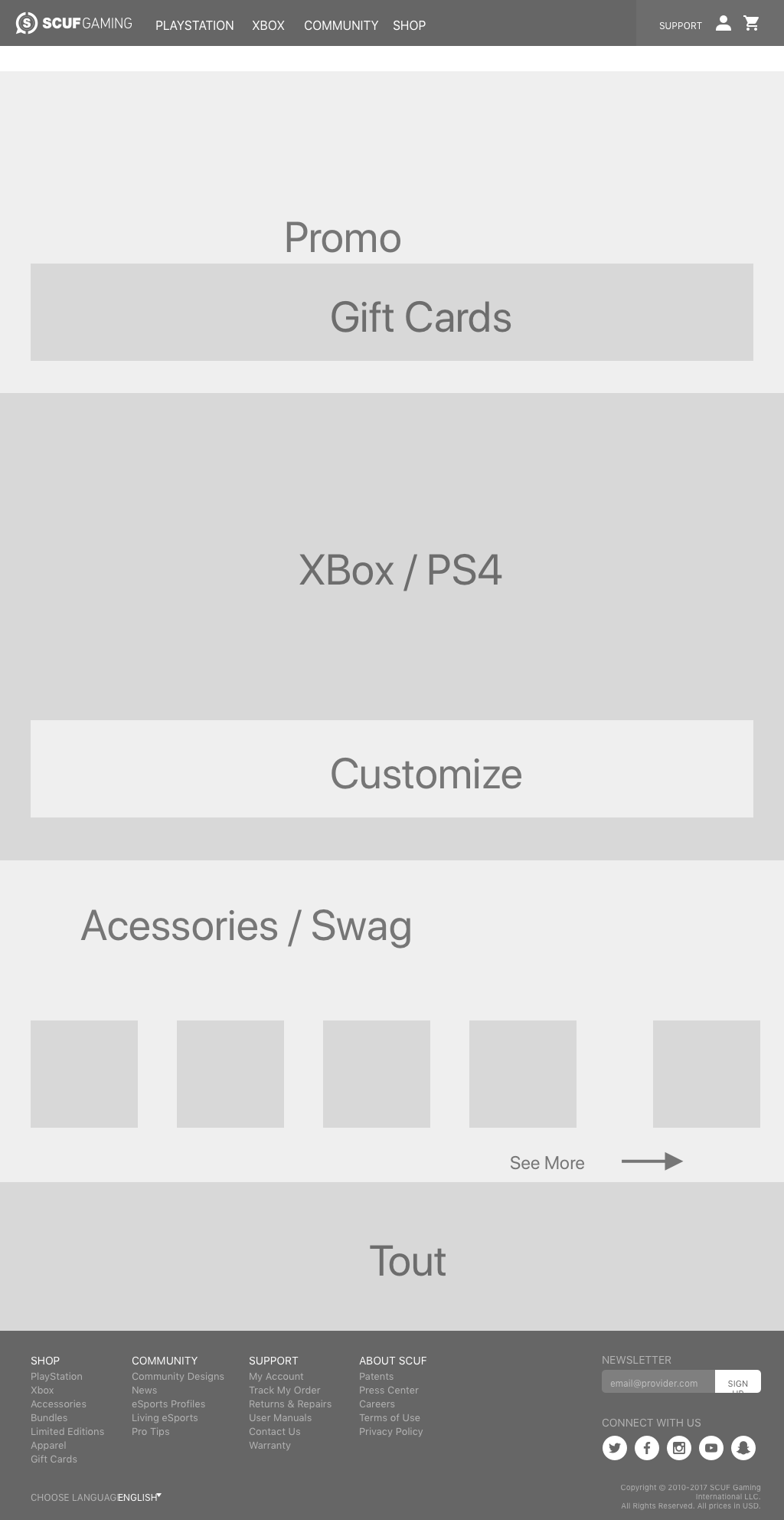
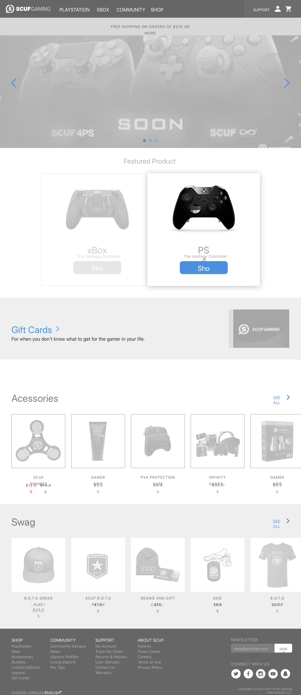
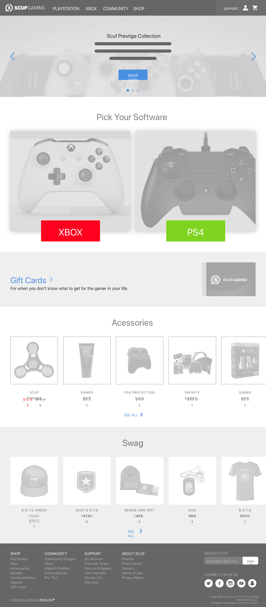
From paper sketches I moved onto Sketch(their prototyping tool of choice).
From paper sketches I moved onto Sketch(their prototyping tool of choice).
Feedback
I was then shown a wireframe from a senior designer, and since then I held myself to a higher standard of wireframing.
I was then shown a wireframe from a senior designer, and since then I held myself to a higher standard of wireframing.
High Fidelity
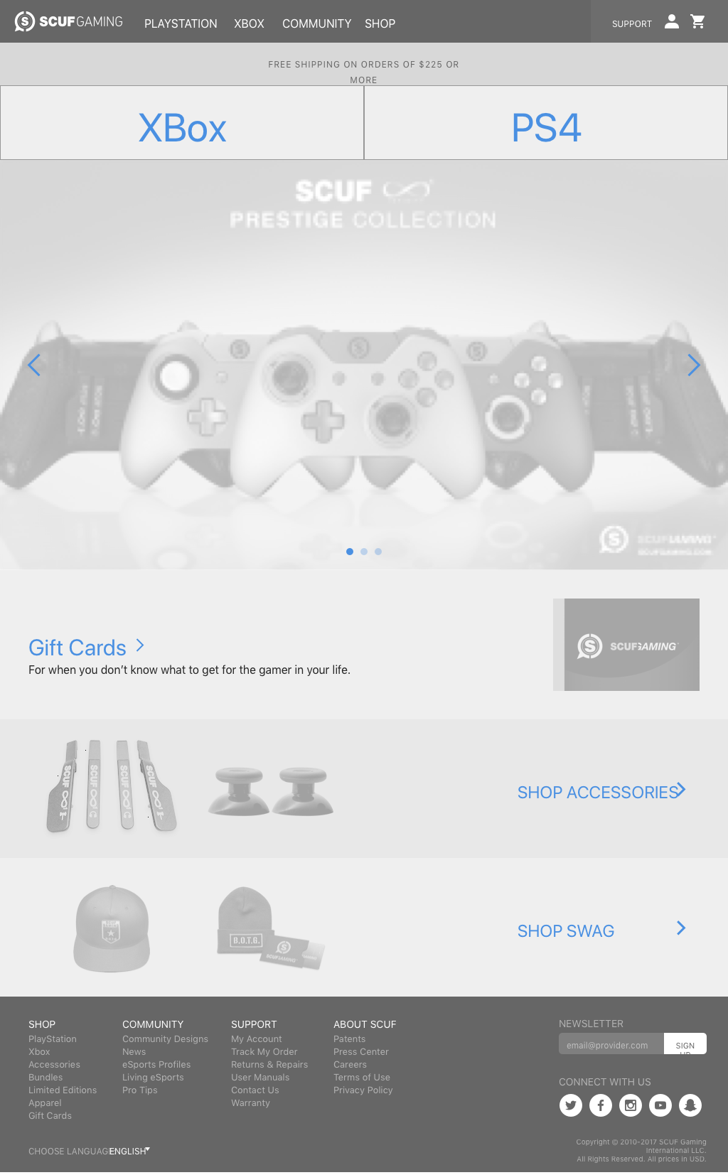
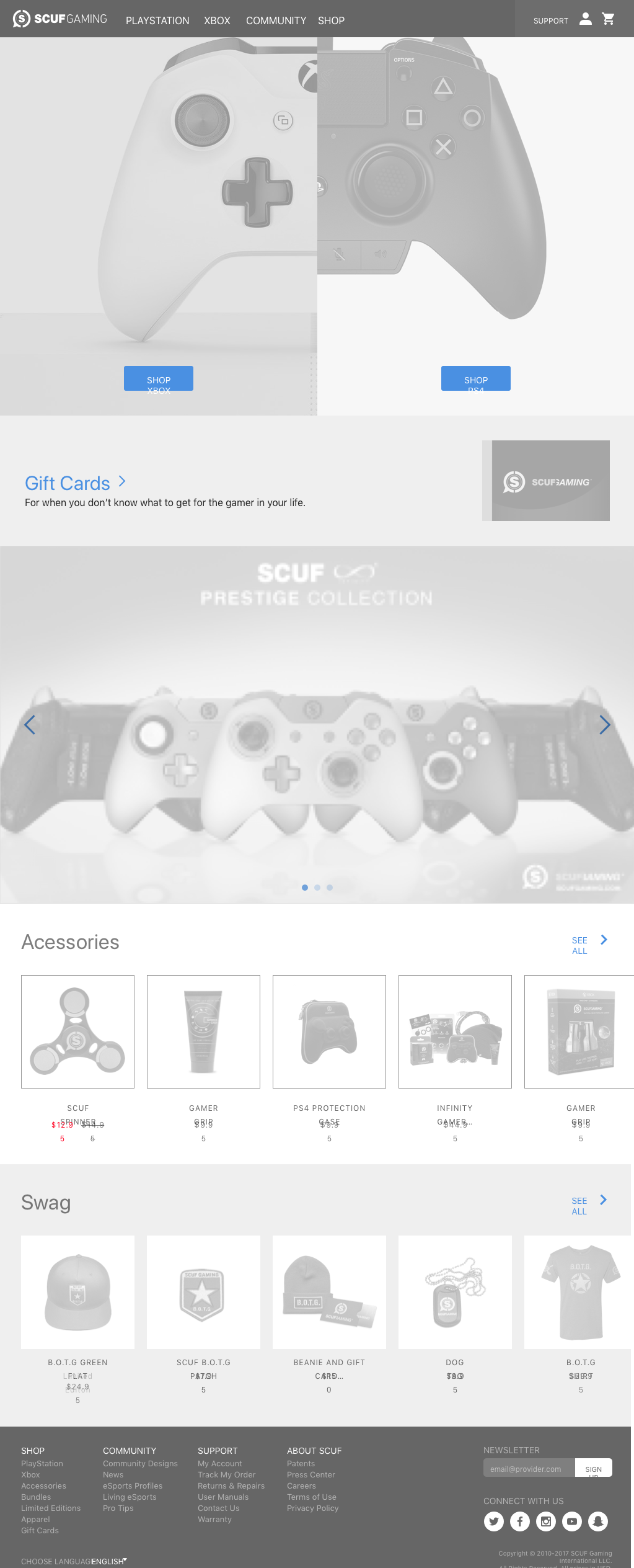
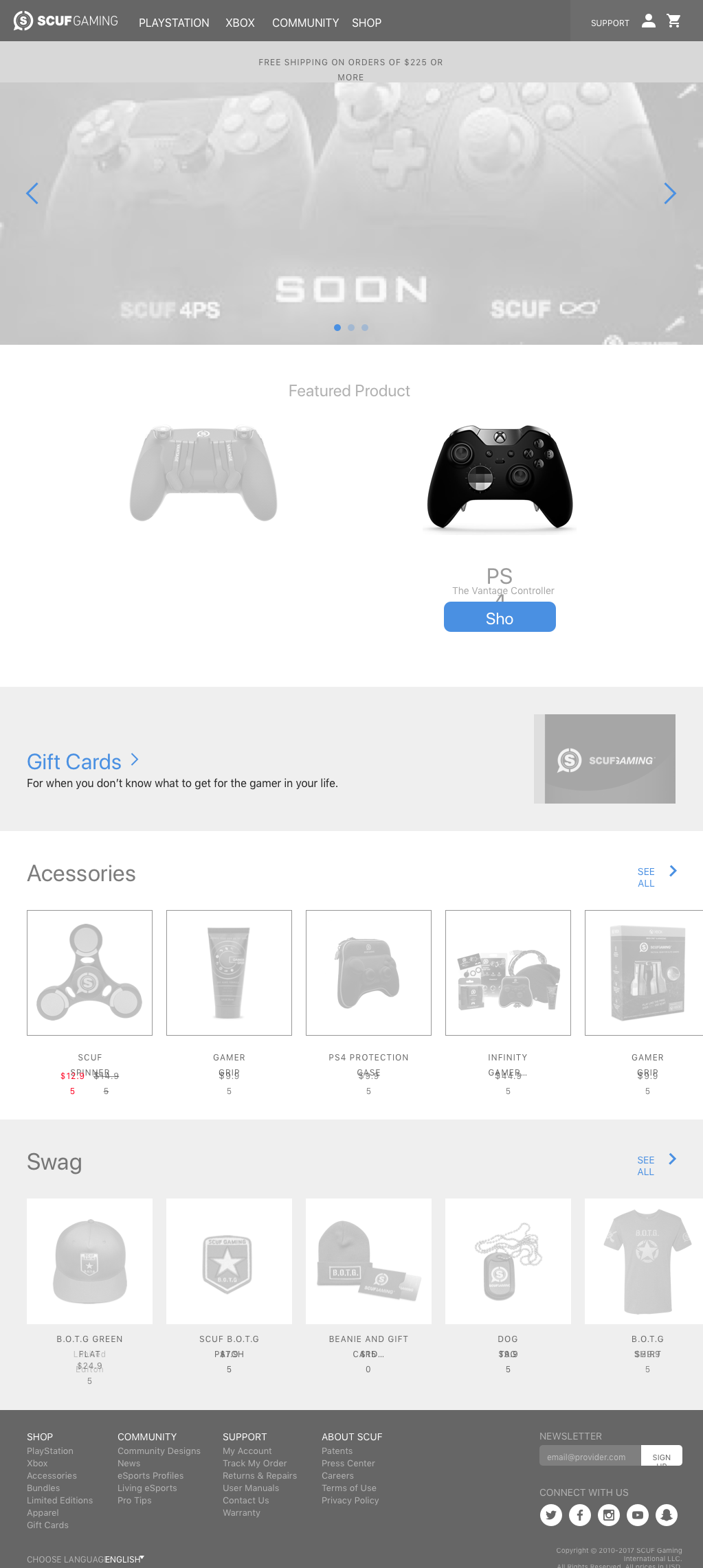
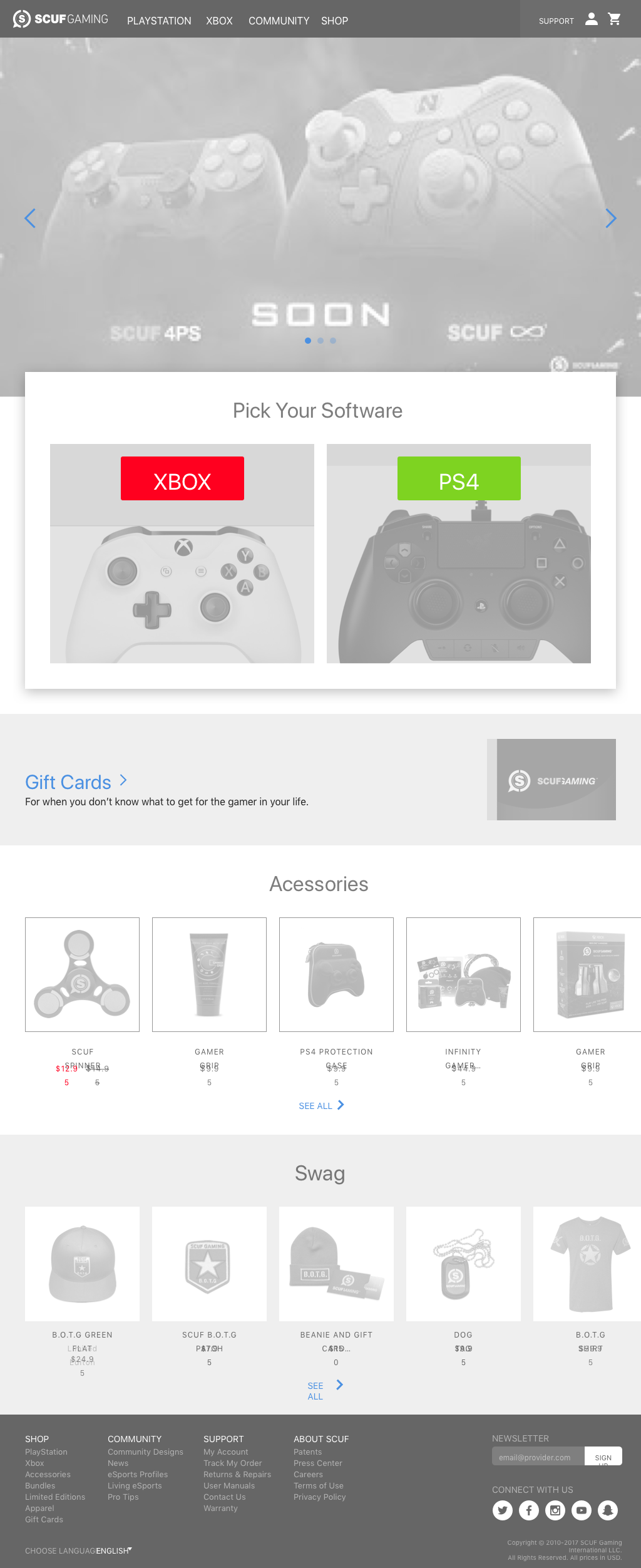
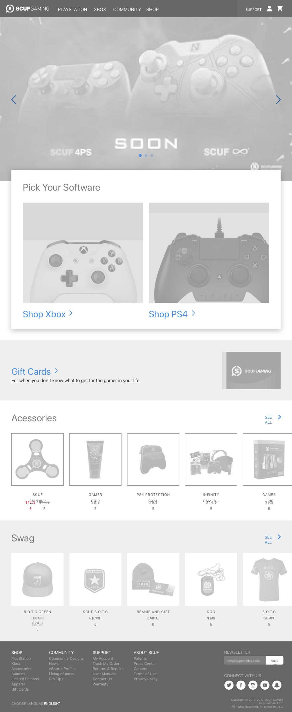
I discovered that Scuf has two audiences: allegiance to either Xbox or PS4. So moving forward, it made sense to split the page between these two allegiances.





Bye Odopod
In the middle of the project I was told the news that the company has shutdown. Still, I'm thankful for the two weeks.
In the middle of the project I was told the news that the company has shutdown. Still, I'm thankful for the two weeks.
